Terms & conditions update emails
Terms of service emails, privacy policies, and protection terms - oh my!
Sending out a terms & conditions update email and want your subscribers to read it?
It seems the norm is to hyperlink multiple times throughout emails in this format and create a massive email that is a bore to read (I’ve just hyperlinked to my site FYI, for example purposes):
We’re updating our Terms of Service, Payments Terms of Service, Privacy Policy, Host Damage Protection Terms, and some of our other terms and policies (“Terms”).
Read more if you want, and if you don’t like it you can cancel your account.
Read the updates.
I take the example above and immediately think, “oh, this email team has been directed by legal to update the audience and has zero investment in actually making the audience aware of the changes.” Which honestly is very relatable and probably a resourcing issue and not on the shoulders of the email team to drive. What are the problems with this?
As a reader I have to do work to understand what’s changed
As a reader I have to read through multiple hyperlinks
I am confused and somewhat afraid (not always, but sometimes) of not knowing what’s changed
Producing a terms & conditions update, terms of service, or privacy policy email that is clear and easy to understand can lead to greater customer affinity with your brand and long-term retention of your high-value customers.
Here’s how to maintain the 20-second attention span of your subscriber and ensure they are aware of changes you’re making. Hint, do these 3 things:
Write in a human voice. Your brand voice doesn’t need to die when it comes to sending transactional emails.
Break the content up visually to avoid a “wall-of-text” approach.
Be clear! Let people know what’s actually been updated.
Monzo (a UK D2C digital banking app) communicates their updates in easy-to-read modules. Key call outs are
Effective date
Specific in what has changed (fees)
How to get in touch if you aren’t happy with the changes (I really liked this - it’s very human)

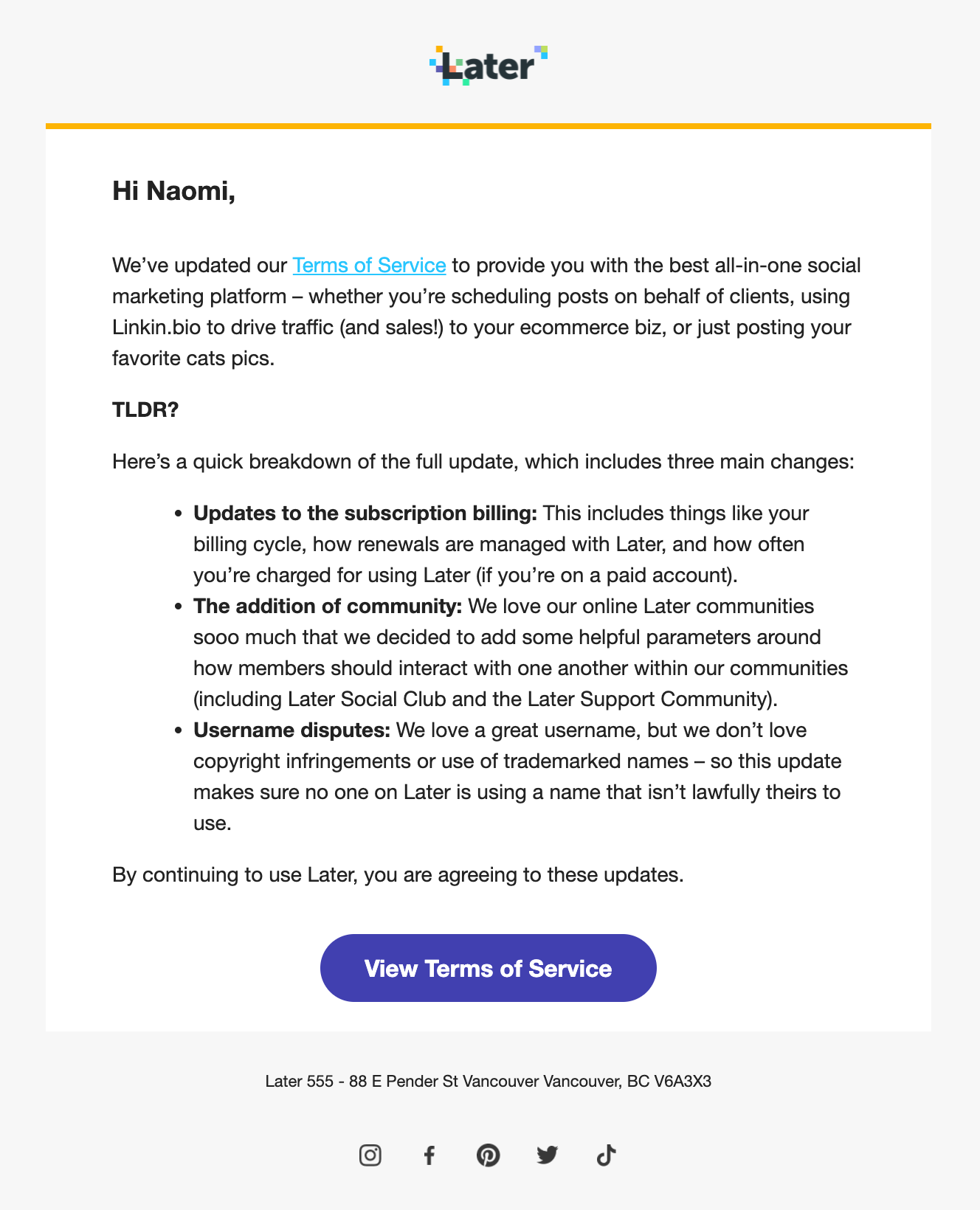
Later (a social media scheduling tool) gives you exactly what you’re looking for - the TLDR!
Typeform (online forms tool) includes an FAQ section of questions they anticipate receiving from his email.

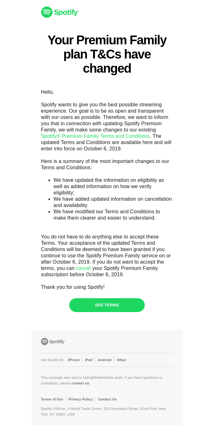
Spotify (music streaming service) highlights broad level changes instead of forcing the user to navigate through a sea of text to pinpoint differences.
Big Cartel (an online storefront business) writes their updates in a human tone. What’s changing, why it’s changing, and why it matters.

Cabify (ride hailing app) starts with stating why they even have these policies and what the policies include. AND includes what you can do if you don’t agree with the policies. This email is really easy to ingest.

It’s easy to write out a novel of what’s changed, but what clearly makes the legible? It’s all in how you break apart the content. My personal favourite is the email above from Monzo. I don’t need to put on my readers, the wall of copy doesn’t scare me away, and it’s digestible. But I chose the examples above because I believe they all have strong unique value, and other brands could take a page from their book!
Transactional emails can have just as much impact as a marketing email, so treat them with just as much kindness, and care.
